Monday, March 13, 2017

Powerline #4 - Cityscape

I decided to continue my idea of slashing and inserting lines into backgrounds to go with my Powerline series.

This piece started out as a class sample from a Nancy Crow class.  I didn't think that I would ever quilt it, but after making a couple of Powerline quilts, I changed my mind.  We can do that, can't we?  Here is the original piece.


I took a picture and printed it out in gray scale, then slashed with the paper version.  I decided to insert a pop of color since the piece was all in black and white.  Here were a couple of my ideas.


I liked the red one the best.  It felt to me like this was a tall metal power pole close up looking at the city far away (maybe across a river?)

I slashed and added burgundy linen/cotton fabric, which really adds some texture, although it's hard to see in the picture.  


I quilted it with both black and white thread in 1/2" straight line rows to represent power lines.  It is finished with red/white/black print binding.

Powerline #4 - Cityscape by Joanne Adams Roth


Now, I like it and I hope you do too!

Friday, March 10, 2017

Planning a quilt show

Clark County Quilters is my local guild and I'm proud to be an active member!  So many good things happen when you're around so many talented people.  So many friendships.  And so much work!

I like to volunteer, give back, and be active in helping the guild achieve it's goals.  Our biggest fund raiser for our coffers is our annual quilt show.  This year, I'm helping with the layout, hanging, judging, and collecting funds.  My hats off to the people who are actually in charge - they have to work at it all year.  I only step in about a month ahead of time.

Since my background is in engineering and I still have all the drafting tools, I absolutely love to work on the layout of the show.  It's like a big mathematical jig saw puzzle.  One other member also has the same kind of brain I do, and together we are dynamic duo.  So much fun for us.

We got the list of quilts this week from the chairperson and started working on the layout.  We've rented a larger, new space, so we're kind of starting from scratch again this year.  We will be trying to fit over 300 quilts into the space, along with special exhibits, vendors and concessions areas, as well as a featured artist display, a classroom, and a demo area.  Wow!  I know it'll be great when we finish and the show will be fantastic.  Our biggest and best yet!


Monday, March 6, 2017

Strip pieced quilt from Nancy Crow's class - Powerline #3

I pulled out the rest of my strip pieced fabrics from the Nancy Crow class in October.  In an earlier blog, I showed the picture of the quilt top that I pieced in the class, then later ripped apart.  I used two of the strip sets to make Powerline quilts, which I also blogged about.  This quilt top is from some of the remaining strip sets.

I modified the center piece to reduce the size of the vertical elements and I like this much better.  They were originally 12" high and are now 5".   I added 2" black strips to help contain the many seams from the strips and to give some places for the eye to rest.  After I sewed this together, I auditioned a few more strips, but decided to end it where it was.


To help me continue with the design process, I printed a few black and white pictures.  I considered  cutting it apart and adding more black to make it less rigid and vertical, even though it was designed to be a vertical strip quilt.

Here were some of my ideas (the white would actually be black):


In the end, I went with the idea on the left. It gave me a feeling of the powerlines towering above the  houses and vegetation below.   And it was the opposite of my previous powerline quilts, where the strips were pieced and the background was solid.  This one is solids against the strip pieced background.  Not as minimal as the others, but fun, nonetheless.

To insert the black lines, I first marked the location of the cuts with pins, using match marks from my photographs, then with a long ruler and a white chalk pencil.


After the lines were marked, I positioned the smaller black strips against the background, abutting each against the chalk lines.  A design wall is so helpful to get this done.  I sewed these onto the top before cutting it apart because all of the seams and bias edges would create a nightmare if I didn't at least keep one edge in check.  


Black inserts pinned in place

After sewing the seams, I cut the top along the chalk lines, matched up the other side, and sewed it in place.  I pressed the top fairly well at this point.  Then, I followed this process for the larger black insert.   I knew that if I made this final cut and sewed the edges together that the vertical strips would not line up.  So, I trimmed a section from the background.  The insert piece was 5" cut size.  So the amount cut out from the background was 1" less, or 4".  

Here is the completed top.


Completed Top
I decided to quilt this with two colors of thread and include circles to mimic the printed fabric.  Here is the completed quilt.

Powerline #3 by Joanne Adams Roth
I hope you like it!

Monday, February 27, 2017

Powerline #2

I've made my second contemporary quilt in my Powerline series.  The strips for this piece were made during my class with Nancy Crow in October.  It was so intensive and we sewed from 7 am to 9 pm every day.  This naturally resulted in a lot of strip pieced fabrics.  The fabric strips for this piece weren't used in my original quilt (which I later ripped apart).

I used to love the combination of turquoise, red, and black ... I guess I still do.  You see, I was always told that I was part Navajo.  My father's father told the family that he was half Navajo and that his mother's name was "Morning Star".  So that made me 1/8 Navajo.  If you see me, you would notice my reddish hair and freckles, which is Irish.  And it turns out, that is exactly what my DNA test showed.  Mostly Irish and British, and no Native American.  Well, this came as a shock, so other members in our family took the DNA test too.  Then we got an aunt and uncle to take the test.  None of us have any Native American.   My husband says I should stop liking this color combination and artwork since I now know that I am not Native American.  But I do, always have, and probably always will.  Sometimes we are drawn to art and colors because we just like them.  So there.

OK, back to this quilt.

I decided to make the vertical strip wider than the two horizontal ones this time.  Black seemed like the perfect background, so that's what I used.  And as a nod to my previous love of Native designs, I used a moccasin themed fabric for the backing.

Powerline #2 by Joanne Adams Roth
Here it is showing the straight line quilting.  It's a little hard to see the black stitching on black, and it for sure looks better in person.
Powerline #2 by Joanne Adams Roth

Close up of quilting lines

 I hope you like it.

Monday, February 20, 2017

Fabric selections for a project

A lot of people making traditional quilts pick a theme fabric (or main fabric), then match the colors in the theme fabric when they add other supporting fabrics.   This is the easiest method of selecting fabrics that go together because the manufacturer already matched up the colors for you.  For beginners, this is the best method.  But let me suggest a few other methods.

Many years ago,  Jinny Beyer suggested that quilters stop playing the match game, and instead pick colors that are a shade lighter or a shade darker than the one that exactly matches the theme fabric.  She also trained her devotees to add a very dark, a very light, and a bright color to give the quilt more life and interest.  She developed a color wheel of fabrics that RJR manufactured and was one of the first to promise quilters that we would have all of those colors all of the time, even though the prints might change.  Her fabrics are tone-on-tone, which means they read as a single color.  Many other manufacturers followed in her footsteps and now quilters have virtually all colors available all the time - most notable are KONA solids by Robert Kaufman.  I keep a color card on the wall in my studio,which allows me to order any color I want on the internet, or to choose a color and get to the fabric store.

Kona cotton color card

Color theory people train you to look at the color wheel and follow some design rules to get a pleasing combination.  One of my favorite books is, "Color Play" by Joen Wolfrom .  She has a second edition, which I don't yet have, but I'm sure that I would love to have it since I have used the first edition extensively to help pull a pile of fabrics for my quilts.  My all time favorite combination is lime green and reddish purple.  What a surprise, huh?  Here is the color wheel I keep on my bulletin board.  (Notice all the lime green doo-dads?)


Modern quilters expound a "go with your gut" approach, and encourage us to use all kinds of colors and materials, not just 100% cotton.  But they generally stick with lots of white or gray with bright solid colors.  Current popular fabrics are cotton, linen, silk, and shot cottons.   In the Victorian days, silk and velvet were popular.

For my art quilts, I use the anything goes doctrine.  I do pick a color theme that supports the overall feeling of the quilt.  Then I like to pull fabrics of all types to be the base design. Adding unexpected materials like tulle, organza, recycled wool, and gobs of man-made and organic materials give my pieces my own personal spin.  This list includes raw "wool" from llamas, goats, sheep, alpacas and bison.   It also includes found feathers from birds and chickens, vintage trims, yarn, threads, and lichen.  Piling this all of my table before I start really helps.  Then I can cull as I go and see if there is anything else that I need.  This is a picture of how I store my cotton fabrics by color, so that it's easy to pull fabrics.


Whatever type of quilter you are, I hope you can pick from some of the techniques I've learned over the years and give your pieces your own personal spin too!


Monday, February 13, 2017

Heat Wave - Final - "SCORCHED FOREST"

I did some thread work with just the batting in place before I did the quilting.  This was to hold all the loose pieces in place so that it could be rolled without losing the placement and effect of the piece.

After I did that stitching, I sandwiched the layers and quilted it with several colors of orange and bronze thread.

So here is the finished piece.  I named it "Scorched Forest".  It is 35" high x 48" wide.


Scorched Forest by Joanne Adams Roth 2016

I hope you like it!

Monday, February 6, 2017

Heat Wave - Part Two

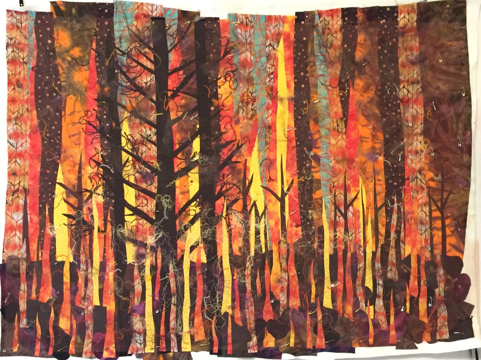
This is a continuation of a previous post on the making of my piece for Heat Wave.  In that post, I showed you how I pieced the top portion.  Now I'm going to show you how I did the lower foreground and added the burning trees.  I turned to a previous method of adding pieces using fusible products to the both the batting and the back of the pieces.

505 Basting spray was used to attach the top pieced section to the batting.  I pulled out the fabrics for the trees, the front vegetation, and the front flames and fused them to Steam a Seam II.  As I randomly cut pieces, I placed them to represent three large black trees and smaller brown trees. When I was satisfied with how they looked, I removed the paper and pressed them in place.


Then I randomly cut pieces to represent the vegetation.  They are basically big blobs that are overlapped with more flames.    You can see the blob shapes below.  I worked on this piece on top of my cutting table so that I had a nice large flat surface.  However, this made it a little hard to tell exactly what effect I was achieving, so I held my camera as high as I could and took a few shots to help me see the big picture.

Bottom portion in progress showing blobs

When I felt it was complete, I carefully lifted up each piece, pulled off the paper, and pressed the pieces onto the background. Then I slid my thinnest pressing surface underneath the top and pressed the pieces in place.  (I converted my old June Pressing board by removing the top foam layer, adding thin cotton batting and a top layer of Duck cloth.)


I added shredded yarn, thread, wool roving, and feathers to complete the look of embers and floating smoke.  Here is the pile of fibers that I added.  I have great friends who save and give me their leftover yarn and thread, and others put things out on our free table at our guild meetings.


I covered the whole thing with a layer of orange tulle and pinned it in place.  I lifted all of this and put it on my design wall for one last look and picture.  We texted the granddaughters to see what they thought.  They texted us back and said, "It looks like a fire in the trees."  So yippee, it looks like what its supposed to.

Forest fire piece pinned and ready to quilt


In my next post, I'll show you some of the thread work and quilting.

I hope you like it so far.